
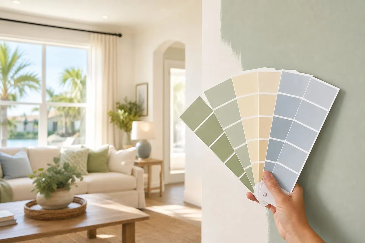
Homeowner Guidance
How Paint Colors Actually Affect How You Feel in Your Home
If Walls Could Talk LLC · Brevard County, FL · Homeowner Guidance
Most people approach interior paint color the same way: they fall in love with a swatch, get it matched, and hope for the best. Then the color goes on the wall and looks completely different from what they expected — too dark, too cold, too blue, too purple.
Color selection is one of the trickier parts of interior painting. Not because there are a bunch of strict rules, but because so many people don't realize how much lighting, undertones, and the rest of the room affect how a color actually looks once it's on the wall.
Here's what I've learned from years of painting interiors — and from watching homeowners make the same few mistakes.
Color Isn't Just About Looks — It Changes How Rooms Feel
This isn't design theory. It's practical. The colors on your walls affect how big or small a room feels, how warm or cool it reads, and how energized or calm you feel in the space. In Florida especially, where we have intense light year-round, how a color actually feels in the room matters a lot.
Most of the research on color psychology is consistent on a few core points:
- Cool colors (blues, greens, soft grays) tend to feel calming and expansive.
- Warm colors (yellows, oranges, warm reds) feel energizing and can make spaces feel smaller and cozier.
- Neutrals are the most flexible — they can read warm or cool depending on the undertone and the light in the room.
- Very dark colors make walls recede, which can make a small room feel cave-like or dramatic depending on what you're going for.
None of this is absolute — context changes everything. But it's a useful starting point before you pick up a fan deck.
Common Colors and What They Actually Do
Whites and Off-Whites
White is the most popular interior color in the US and also the most misunderstood. There is no such thing as "just white." Every white has an undertone — pink, yellow, green, blue, gray — and that undertone reacts to the light in your room. A white that looks crisp and clean in the store can look dingy, pink, or cold on your walls depending on your lighting and what else is in the room.
Off-whites and warm whites (with yellow or cream undertones) tend to feel softer and more livable. In Florida's bright light, cool whites can sometimes look harsh or sterile.
Blues and Greens
These are the most popular choices in Florida homes, and for good reason. Blues and greens feel calming, connect naturally to the coastal environment, and hold up well visually in strong sunlight. Lighter shades make rooms feel open and airy. Deeper shades — navy, hunter green, sage — have become popular as statement walls and work well in rooms that get a lot of natural light.
Watch the undertones here too. Some blues have purple undertones that become more visible in artificial light. Some greens turn yellowish in direct sun. Test in your actual space before committing.
Grays
Gray had a long run as the default "safe" neutral and it's still everywhere. The problem in Florida is that many grays read colder and more industrial under our bright light than they do in showrooms or online. The wrong gray — especially in a room with north-facing windows — can make a space feel sterile instead of sophisticated.
Warm grays (with beige or taupe undertones, sometimes called "greige") tend to work better in Florida interiors. Cool, blue-toned grays are harder to make work unless you have very warm artificial lighting or very specific design intentions.
Warm Neutrals — Beige, Taupe, Greige
Warm neutrals are workhorses. They work in almost every room, read differently depending on the light, and are forgiving enough to let furniture and artwork be the statement. In Florida they tend to feel comfortable and livable without being boring — which is why they've never really gone out of style here even when gray was dominating everywhere else.
Bold Colors — Deep Greens, Navy, Terracotta, Black
Bold colors used well can make a room feel intentional and sophisticated. Used wrong, they feel overwhelming or trendy in a way that ages quickly. A few things that help: bold colors work better in rooms with good natural light, they almost always need more coats to apply properly (budget for it), and they tend to work best as part of a full room concept rather than a standalone decision.
Black ceilings and dark accent walls are genuinely popular right now and they work in the right context. If you want to try it, test it. Don't commit to an entire room based on a paint chip.
Florida Light Is Different — and It Changes Everything
This is the part most national paint advice gets wrong for Florida homeowners.
Florida's intense, direct sunlight affects how colors appear on your walls. The same color can look noticeably different depending on the time of day, which direction the windows face, and the other elements in the room.
This is exactly why testing samples in your actual home is so important — there's no perfect rule that works for every room.
A few things this means in practice:
- Colors can shift significantly between morning, midday, and late afternoon light.
- Warm undertones (beiges, soft yellows, greiges) often feel more balanced and comfortable in Florida's strong light.
- Rooms with west-facing windows are the trickiest — the light changes dramatically from soft morning light to warm, intense afternoon sun.
- South-facing rooms usually provide the most consistent bright light and tend to be the easiest for color selection.
Practical Tips Before You Paint
Test your samples properly
The best way to see how a color will actually look is to test it in your own room under different lighting conditions.
Here are the most practical options:
- Paint a good-sized sample (at least 12×12 inches) directly on the wall.
- Paint samples on a scrap board or poster board so you can move them around the room to different walls and see how the color looks throughout the day under different lighting.
- Use peel-and-stick paint samples. Samplize is the most popular option — they make large samples using real paint from Sherwin-Williams, Benjamin Moore, and other major brands. Sherwin-Williams also offers their own smaller peel-and-stick samples in many stores.
Whichever method you choose, look at the samples in morning light, midday, late afternoon, and at night with your regular lights on. Florida lighting changes colors significantly.
A good trick for spotting undertones
Take the paint swatch you're considering and hold it next to strong primary colors — a bright red, blue, and yellow (or even a pure white). This makes the undertone much more obvious. If the swatch picks up a greenish or bluish cast next to them, it has cool undertones. If it looks slightly yellow, orange, or pink, it has warm undertones. This quick test at the paint store can save you from big surprises once the color is on the wall.
Consider what you're not changing
Your flooring, your cabinets, your furniture — those stay. Any color you choose has to work with what's already in the room. Pull the undertones from your fixed elements and match to those, not just to what you love in isolation.
Sheen affects how color reads
Higher sheen (satin, semi-gloss) reflects more light, which makes colors look slightly lighter and more intense. Flat and matte finishes absorb light and make colors read slightly darker and more muted.
Ceilings matter more than most people think
Painting ceilings bright white when the walls are a saturated color can create a jarring visual break. A ceiling color that's a slightly lighter version of the wall color, or a warm white that picks up the undertone, tends to feel more cohesive.
Not Sure Where to Start with Color?
That's what color consultation is for. Fill out the form on our contact page or call or text (321) 557-6959 and we can talk through your space before you commit to anything.
Color Questions Homeowners Ask
-
What paint colors work best in Florida light?
-
Colors with warm undertones — warm whites, beiges, greiges, and soft blues and greens — tend to feel balanced in Florida's intense sunlight. Cool, blue-toned grays and stark whites often read harsh or sterile here.
-
How do I test paint colors before committing?
-
Paint a sample at least 12×12 inches on the wall, use a movable poster board, or order peel-and-stick samples made with real paint. Then check it in morning, midday, late afternoon, and nighttime light — Florida light shifts colors dramatically through the day.
-
Should ceilings always be painted white?
-
Not necessarily. Bright white over saturated walls can create a jarring break. A slightly lighter version of the wall color, or a warm white that picks up its undertone, usually feels more cohesive.